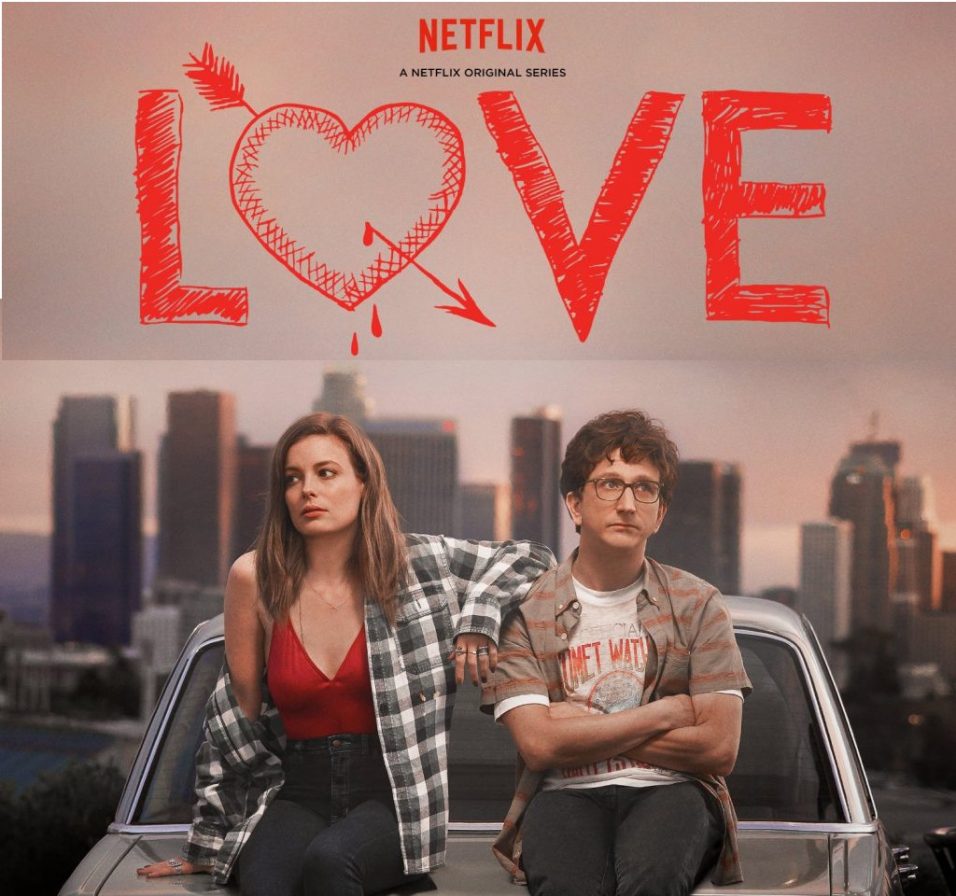
LIKE everyone else in this trash fire of a year, I’ve been bingeing a lot of streaming content to distract myself from our descent into what is almost certainly a prequel to Mad Max: Fury Road. One of the shows I’ve re-watched is Love, produced by Judd Apatow and starring Gillian Jacobs and Paul Rust.
If you’ve never watched it, it’s essentially the story of two incredibly fucked-up people as they meet and eventually fall in love. Neither one is a very nice person, really, and a lot of the show falls under the category of ‘cringe comedy’ as you watch two lo-fi awful people grow and evolve into a more or less mature relationship. It’s kind of a dramedy, not exactly a laugh riot. I recognize myself in the two lead characters, in the sense that they are both monsters slowly realizing how monstrous they are and making fumbling attempts to own their bullshit, and that likely brought the series home for me.
I’m no connoisseur of Apatow’s work; I’ve seen a few things and enjoyed a few things, but I haven’t exactly made a study of his comedic empire. But I’ve noticed that in this series there’s some nice visual storytelling. Writing isn’t just about words; the visuals you use or show are just as important. One mistake a lot of writers fall into is making their visual storytelling very obvious. Love manages to keep it all very, very low key, and it works pretty beautifully.
Clothes
First of all, this show manages to create a very specific fictional universe. All TV shows and films do this, of course—they select settings and costuming that establishes something about the characters and the world they inhabit—but Love did an exemplary job of it.
Mickey’s wardrobe is a prime example. Aside from being on-brand for her character, what’s interesting about it is how limited it is. Many television shows have the characters in different clothes all the time, unless an article of clothing is iconic to their character like Fonzi’s leather jacket—this is especially true of female characters, who are often portrayed as clotheshorses for no other reason than the fact that male writers assume this is true about all women.
But Mickey actually wears outfits more than once, and individual separates appear in different configurations. You know, like a real person’s wardrobe. Mickey doesn’t have a spacious walk-in closet and endless budget for clothes. She buys thrift and is thoughtful, but like a real human being she wears things over and over again. That’s a great piece of visual storytelling.
Another is Mickey’s T-shirts. She wears a wide variety of hipster-ish T-shirts, including one she borrows from Gus when she (platonically) sleeps over at his place after telling him she doesn’t want to be in a relationship and they have an adventure. That shirt pops up again in the series finale when they (spoilers!) get married, which is both a nice callback and an indication that Mickey’s T-shirts tell a story. It’s easy to imagine that each of those shirts, from seemingly random places, are all stolen (borrowed) from people in her life. Ex-boyfriends, ex-roommates, one-night stands, friends—all these T-shirts forming this record of Mickey’s life.
Stuff
Love also treats the objects and possessions the characters possess as part of its storytelling. Gus drives an aging Prius, complete with dent in the door, which perfectly matches the character both in terms of self-image and financial straits. Mickey drives a busted old Mercedes, because she’s a broke hipsterish L.A. woman, but it’s also in immaculate shape. Mickey herself is a mess, but she cares for her things.
When Mickey, an addict, makes a first stab at sobriety early in the show, she re-arranges everything in her apartment and organizes her books by color. This is a fantastic visual—it’s a superficial improvement, just like this first attempt at sobriety, and because it’s impulsive and not well-planned, it actually causes her more trouble than it solves. A great little callback joke happens much later where Mickey, having agreed to cook an elaborate dinner, can’t find her cookbook and asks her roommate what color she thinks “The Joy of Cooking” would be.
Gus’s apartment is also a powerful symbol if you’re the sort to think too much about writing and storytelling. After breaking up with his girlfriend in the first episode, he moves into a furnished apartment, the sort of temporary place newly-divorced Dads move into, or people just starting out. On an obvious level, he does this because at the time he thinks he might get back with his old girlfriend (he explicitly says this at one point in the show). On the other, it’s a perfect indication that Gus is very performative. He hesitates to express his personal style (more on this below) and uses a generic approach to hide himself. Whereas Mickey’s apartment is crammed with knick-knacks and decorations and thoughtful style decisions, Gus is literally living in someone else’s (awful) taste. Later in the series, when he and Mickey have progressed in their relationship, she begins to influence his style and he starts to brighten up a bit.
The Rug
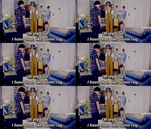
Finally, the detail that set off this essay, which might be something I’m reading far too much into. In the first episode of the series, just before Gus breaks up with his girlfriend, he orders a rug for their house. He wants it in gold, she insists it should be in blue. The day he breaks it off and leaves, the rug is delivered, so he takes the blue rug he didn’t want and puts it in his new apartment, a perfect symbol of Gus accepting a generic substitute for what he really wants.
When he meets Mickey, she has the same rug in her place—except it’s the gold version he originally wanted. That’s an obvious but graceful symbol that their relationship is meant to be, a nice visual connection between the characters the show obviously intends for us to notice.

In the seventh episode of season three, “Sarah from College,” Gus and Mickey go to a wedding of one of Gus’ old college friends, and meet Sarah, who Gus was once engaged to. Gus never told Mickey about this part of his life, and tension ensues. That tension gets worse when Sarah gets super drunk and Gus agrees to drive her back to her hotel over Mickey’s enraged objections. At the hotel, Sarah tells Gus how miserable she is, and he sadly tries to comfort someone who was once a big part of his life as he realizes how good he has it in the present.
On the bed is a pillow with a similar—similar, not exact—pattern as the rugs. It certainly could be a random piece of set dressing that I’m thinking way too hard about, but I prefer to see it as a subtle visual lining Gus and a woman he once wanted to marry in the same with the rugs link him to the woman he (spoilers!) will eventually marry.
A final note on Gus and his performative nature: The most telling detail in the show is that when he proposed to Sarah, it was a tragically huge production involving flying both sets of parents out to Los Angeles and having a violinist appear out of nowhere. Gus is performing, overdoing it. But when Mickey and Gus get married, it’s an elopement on the spur of the moment—which is then called off when they have a moment to think, only for them to sneak away from their friends and get hitched anyway all by themselves, with zero production at all. It’s a nice, subtle sign of character development.
That’s it for this episode of Jeff Takes Shit Far Too Seriously. When you write stories for a living it’s hard to turn off that machine in your head, which is, of course, why I drink.

