One of the best parts about being an adult (i.e., old as heck) is the ability to just create stuff on a whim. As a kid, I always wanted to make stuff, to be creative, but as a kid you lack resources. Also, I grew up a very, very long time ago seemingly before electricity. My brain still gets wrinkled that I can fire up my computer and self-publish books, create music, create text adventure games, and any other strange idea I might have. I mean, seriously, this shit is magic to a kid who had to pretend an old hand-me-down tennis racket was a guitar when he was 12.
It’s just fun to create stuff, even if you’re not an expert. I mean, I’m no professional graphic designer or visual genius, but creating covers for my Avery Cates novella experiments and the resulting novels is just fun. And they’ve been quite a journey.
The Shattered Gears
When I first began writing the new Avery stories, it was solely because I had an idea and I wanted to try a different way of working. Normally when I write a novel I start at the beginning and write til I get to the end, all in one monolithic effort. This time, with zero market pressure, I could just play around with short sections and see what happened.
 So, when I designed the first cover for the very first novella, The Shattered Gears, it was a bit of a throwaway effort. I wanted to echo the vastly superior work of Lauren Panepinto with the Orbit covers (and obviously failed miserably, because Lauren’s work is amazing), so I went with a silhouette of a badass and some simple and distressingly obvious gear textures. The rest of the novella covers weren’t much more creative than that, though I think they pop off the screen well enough.
 When time came to collect those first novellas into a novel, I got a little more ambitious with the cover design. It’s still a very simple silhouette-based concept, but I added some texture and lighting effects to make a little bit more interesting. I was especially proud of adding in the sci-fi gun to the silhouette. But then, really simple achievements make me outlandishly happy. It’s one reason why I love to make stuff.
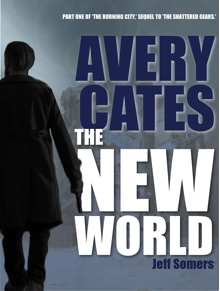
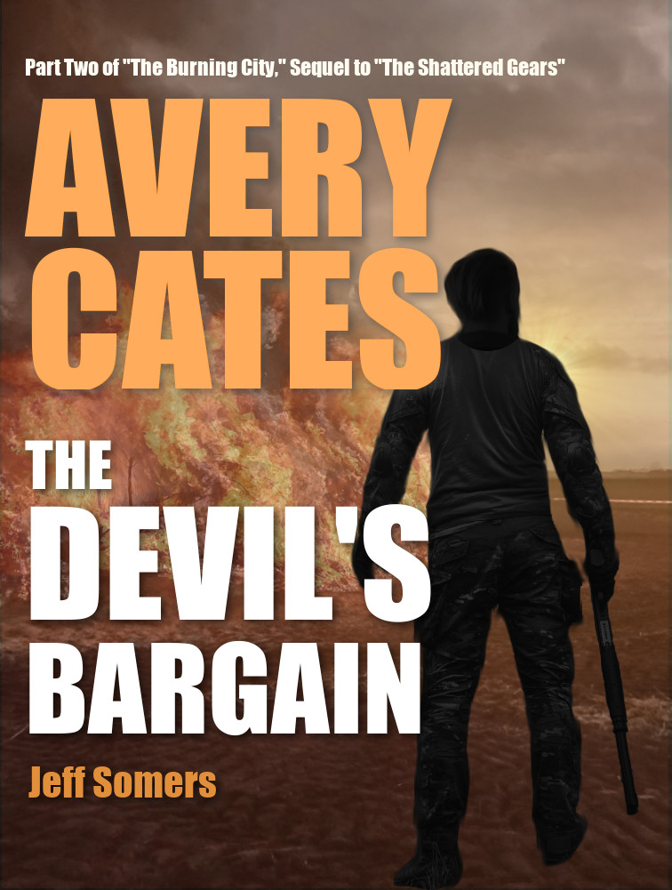
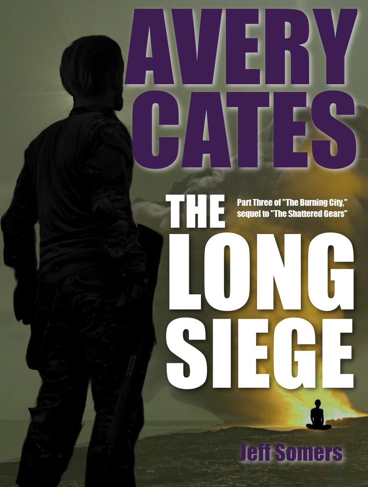
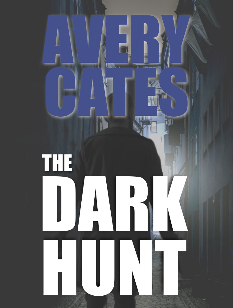
Last year I started working on the sequel to The Shattered Gears, a novel titled The Burning City. Once again I wrote it as a series of semi-standalone novellas that I published individually, beginning with The New World. I decided that I wanted to up my game a little for the cover design, because it’s fun. So while I kept the fundamental silhouette aesthetic, I went with a more photo-realistic approach.
I think they turned out pretty good. And I kept the theme going with the cover for the omnibus edition (all four novellas collected into a single novel):
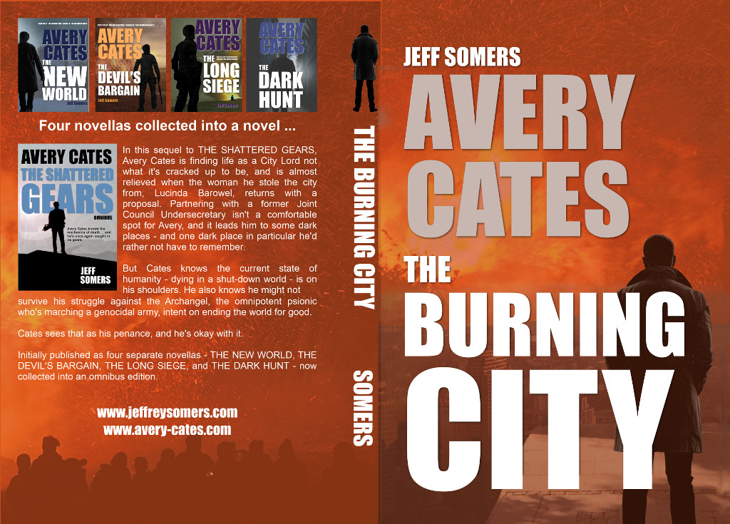
Again, I’m no graphic design genius, and I probably could have done a lot of this much better. But I’m kind of proud of how these turned out, and I remained kind of childishly amazed that I can just … do this. I can literally just create whatever the hell I want.
You can pre-order The Dark Hunt (novella #4) and The Burning City (the novel) right now, if you want. Come on, you know you want to.
